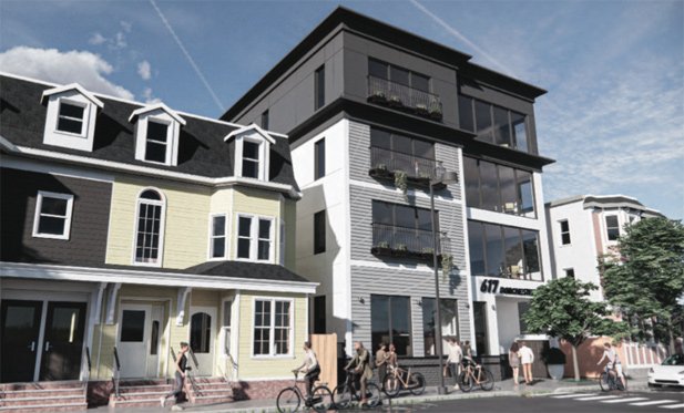
Quadruple-decker-like condo building proposed for Dorchester Avenue in the Polish Triangle

Rendering by Context.
A pair of developers have proposed a four-story, 18-unit condo building on what is now a vacant lot that stretches between Dorchester Avenue and Boston Street in the Polish Triangle, just south of Andrew Square.
In their filing with the BPDA, developers Mark Little and Jack Ordway say three of the units in their $7-million building would be sold as affordable.
The building, roughly a tenth of a mile from the Andrew Square T stop, would have no on-site parking.
The proposed project will be building out an underutilized site, to fit contextually at an urban scale with its abutters and surrounding neighborhood. Overall, the building is designed with a modern aesthetic; however, small design decisions, including the use of cornices, building mass setbacks, and careful considerations to material and color, all contribute towards a more visually cohesive streetscape. The site is visible along the Southeast Expressway (Interstate 93) and among commercial and residential roads which will serve to enliven and enhance the surrounding context.
They hope to begin roughly nine months of construction in early 2024.
In addition to the BPDA, the Zoning Board of Appeal would also have to approve the proposal.
Ad:

Comments
Secret powers
What device is housed here that attracts all those bicycles?
Everyone knows
The more random styles of windows a single house has, the more cyclists will flock to it.
Does that developer plan to get a discount on materials by buying up all the odd leftover pieces kicking around the supply shops?
huh?
the windows on the right top three stories and the street level all look the same size and shape. the windows on the 2-4 left side have similar looking framing and width, but are slightly shorter.
the windows on the side also look like they’re framed similarly but are smaller - pretty standard for side windows meant for letting light in rather than looking out of.
i’m not crazy about the whole aesthetic but i wouldnt describe it as “odd leftovers”.
I was looking at the building on the left
TBH I though the building on the left was part of the proposal since they obviously re-created it in their model. The actual building which is currently there doesn't look as out of place with the variety of windows and doors since it's not new construction and reflects periodic updates over the years by various owners.
IDK
I think it's pretty bad. What compels people to do something like put up stupid plastic fake shutters that are out of proportion to the windows? And randomly pointy. Also the door-to-nowhere, complete with stupid shutters. Why.
Cute building
You can tell they're trying to reference the language of those boxy older triple deckers but also in a more modern way with all the glass. A thousand bonus points for not cladding the whole thing in hideous fiberglass pop outs of various mismatched colors, too.